Chapter 8 Fisher-Wright
8.1 Outline
- COVID
- Fisher Wright vs Galton Branching Process
- FW with mutation
- Extinction
- Application: Baby Names
Additional resources:
Blog “Introduction to the Wright-Fisher Model” https://stephens999.github.io/fiveMinuteStats/wright_fisher_model.html#pre-requisites
Hahn and Bentley (2003): Evolutionary anthropologists arguing that the neutral explanation of the Fisher-Wright model is consistent with the distribution of 1st names. What other quantitative or qualitative features of 1st name fashion could be used to try to reject the neutral model?
Felsenstein (2005): Very complete “lecture notes” for graduate genetics course. Lots of good commentary, does not assume a lot of math background, but lots of content and can be diffcult to read a piece by itself.
8.2 Parallel
Fisher-Wright
- Children picking their parents (not “generative”)
- Total population size is constant: process goes backwards
- Qualitatively similar to BP. Extinction and fixation.
- Flexible: mutation, selection, even changes in pop size.
- With apologies, biologists take FW “seriously” even if they don’t take it “literally”.
Galton-Watson-Bienaymè Branching Processe
- Branching process models independent parents randomly producing offspring. “Generative”
- Total population size can vary, and has a random component and deterministic one \(m\)
- Qualitative result when \(m = 1\) is that there is one longest surviving line. This is “fixation”, when one type becomes universal.
8.2.1 Another cell phone example
As in the Branching Processes chapter, let’s simulate the creation of generations using the numbers of cell-phone numbers (which are random). For this case, we need as many cell phone numbers as the generations to create, but each next cell phone number is a combination of digits from the first cell phone number.
Let these ficticious cell phone numbers be: 731 660 5362 and 530 666 7723. Note how the second number does not contain any 4s, 8s or 9s.
Generation 1 starts off with a sequence of numbers from 0 to 9. Then for generation 2, we assign each digit of the cell phone to one of cells. We repeat this for generation 3 but with the second cell phone number.
  knitr::kable(
  cbind(c(1:3), rbind(c(0:9),c(7, 3, 1, 6, 6, 0, 5, 3, 6, 2),
        c(5, 3, 0, 6, 6, 6, 7, 7, 2, 3))),
  col.names = c('generation #', 'allele type', "", "", "", "", "", "", "", "", ""))%>%
kableExtra::kable_styling(full_width = F) | generation # | allele type | |||||||||
|---|---|---|---|---|---|---|---|---|---|---|
| 1 | 0 | 1 | 2 | 3 | 4 | 5 | 6 | 7 | 8 | 9 |
| 2 | 7 | 3 | 1 | 6 | 6 | 0 | 5 | 3 | 6 | 2 |
| 3 | 5 | 3 | 0 | 6 | 6 | 6 | 7 | 7 | 2 | 3 |
If we translate this graph into a tally of the alleles by generation we see that some alleles are passed/‘’survive’’ more than others.
  knitr::kable(
  cbind(c(1:9), c(rep(1,9)), c(1, 1, 2, 0, 1, 3, 1, 0, 0),
        c(1, 1, 2, 0, 1, 3, 2, 0, 0)),
  col.names = c('Allele type', "1", "2", "3"))   %>% add_header_above(c(" " = 1, "Count per generation" = 3))%>%
kableExtra::kable_styling(full_width = F) | Allele type | 1 | 2 | 3 |
|---|---|---|---|
| 1 | 1 | 1 | 1 |
| 2 | 1 | 1 | 1 |
| 3 | 1 | 2 | 2 |
| 4 | 1 | 0 | 0 |
| 5 | 1 | 1 | 1 |
| 6 | 1 | 3 | 3 |
| 7 | 1 | 1 | 2 |
| 8 | 1 | 0 | 0 |
| 9 | 1 | 0 | 0 |
- Here, allele type 6 will most likely dominate. This means that everybody will likely become similar and that individual types disappear.
NOTE FOR JOSH: does this explanation make sense? I had a hard time following the cell-phone number example in class so my notes are incomplete. Also, it’s not so straightforward to me how the “Children are choosing their parents here”. Could you explain this more?
8.3 Mutation
Let’s simulate the process from the example below. We first present some useful functions.
  fwm <- function(N, n_gen, mu = 0) ## mu != 4/N
  {
      ## simulate fisher-wright (with mutations)
      x <- paste(1:N) ## starting types
      A <- matrix(NA, nrow = n_gen, ncol = N)
      for (i in 1:n_gen)
      {
          A[i,] <- x
          x <- sample(x, size = N, replace = T) # Sample from previous generation and draw with replacement
          x <- mut(x, mu)
          x
      }
      return(A) ## matrix of types, each line a generation.
  }

# Function to detect number of mutations. This occurs with probability mu.
  mut <- function(x, mu)
  {
      ## m, the individuals that mutate
      m <- which(rbinom(length(x), size= 1, prob = mu) == 1)
      if (length(m) == 0) ## if no-one mutates
          return(x)
      ## add a suffix to their ID, so it will be unique (infinite alleles)
      suffix <- 10000*round(runif(length(m)),4)
      x[m] <- paste0(x[m], ".", suffix)
      x
  }
Here we try it out. - Each row is a generation and each column is a type of allele. - Notice that already by the third generation, there are several numbers that are not drawn anymore: 3,4,6,8,9.
##      [,1] [,2] [,3] [,4] [,5] [,6] [,7] [,8] [,9] [,10]
## [1,] "1"  "2"  "3"  "4"  "5"  "6"  "7"  "8"  "9"  "10"
## [2,] "9"  "4"  "7"  "1"  "2"  "7"  "2"  "3"  "1"  "5"
## [3,] "2"  "5"  "7"  "5"  "2"  "1"  "2"  "2"  "1"  "1"
## [4,] "2"  "2"  "5"  "1"  "1"  "2"  "5"  "7"  "1"  "1"
## [5,] "1"  "2"  "1"  "1"  "1"  "1"  "5"  "2"  "1"  "7"
## [6,] "1"  "5"  "2"  "1"  "7"  "5"  "1"  "7"  "1"  "2"
The graph below shows a simulation of 20 generations each of size 10. The colors represent different types drawn in each generation.
  set.seed(1)
  A <- fwm(N = 10, n_gen = 20, mu = 0)
  tt <- table(A, row(A)) ## count types by row
  ptt <- prop.table(tt, 2) ## proportions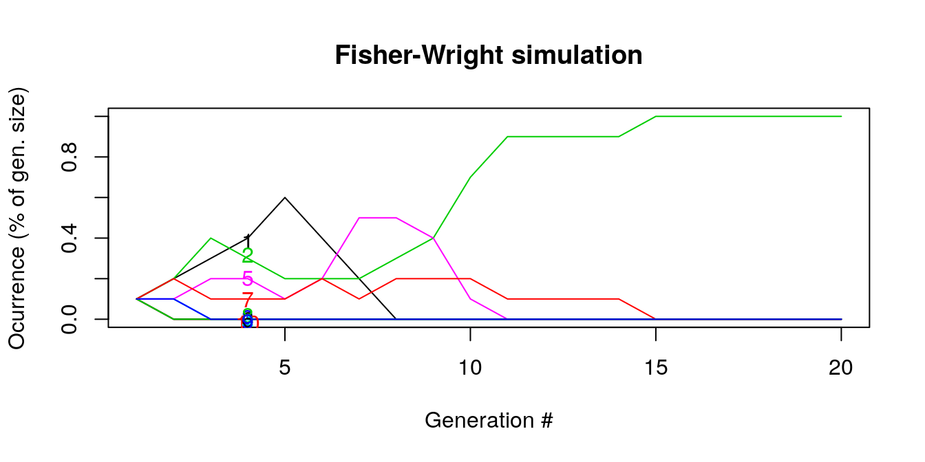
Figure 8.1: Generation composition
Let’s analyze it more.
- By generation 5, many of the lines are flat (ocurrence = 0%) which means that they go extinct and the following generations can only select types from a reduced sample.
- For instance line “5” (pink) is selected until generation 10. Around generation 7, it becomes the most prevalent type but then falls as other types are drawn relatively more. As we are looking at the ocurrence in samples were types disappear, the rises and falls in lines are indicate the substitution of numbers as some go extinct.
- By generation 15, all draws are 2s and the other numbers do not ‘’survive’’
- \(E(p_i(t) | p_i(t-1))\) is the likelihood that the same number (type) will be drawn given that it was drawn before. NOTE TO JOSH: is this really what the expectation means? Not on slides
This time, let’s increase the number of generations (200) and the number of types drawn at every step. In the long run, many of the colored lines disappear and the generations are composed of a handful of types.
  set.seed(1)
  A <- fwm(N = 100, n_gen = 200, mu = 0)
  tt <- table(A, row(A)) ## count types by row
  ptt <- prop.table(tt, 2) ## proportions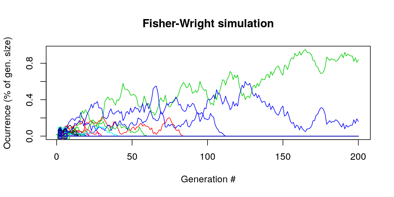
Figure 8.2: Generation composition long term
8.4 Fixation
Given that we saw before that some of the lines will disappear, we can look about keeping some of the lines fixed (that it will always be selected). For instance,
- What is probability that line \(i\) will “fix”?
- What is expected time until some line fixes?
- How can we describe the path to fixation?
8.4.1 Probability that a particular line will “fix”
NOTE TO JOSH: the slide said that finding this was easy but I don’t necessarily see how the result from the graph goes with the formula below.
  set.seed(1)
  A <- fwm(N = 10, n_gen = 20, mu = 0)
  tt <- table(A, row(A)) ## count types by row
  ptt <- prop.table(tt, 2) ## proportions
  matplot(t(ptt), type = 'l', lty = 1, main = "FW simu")
  text(x = 4, y = jitter(ptt[,4]), rownames(ptt), col = 1:6)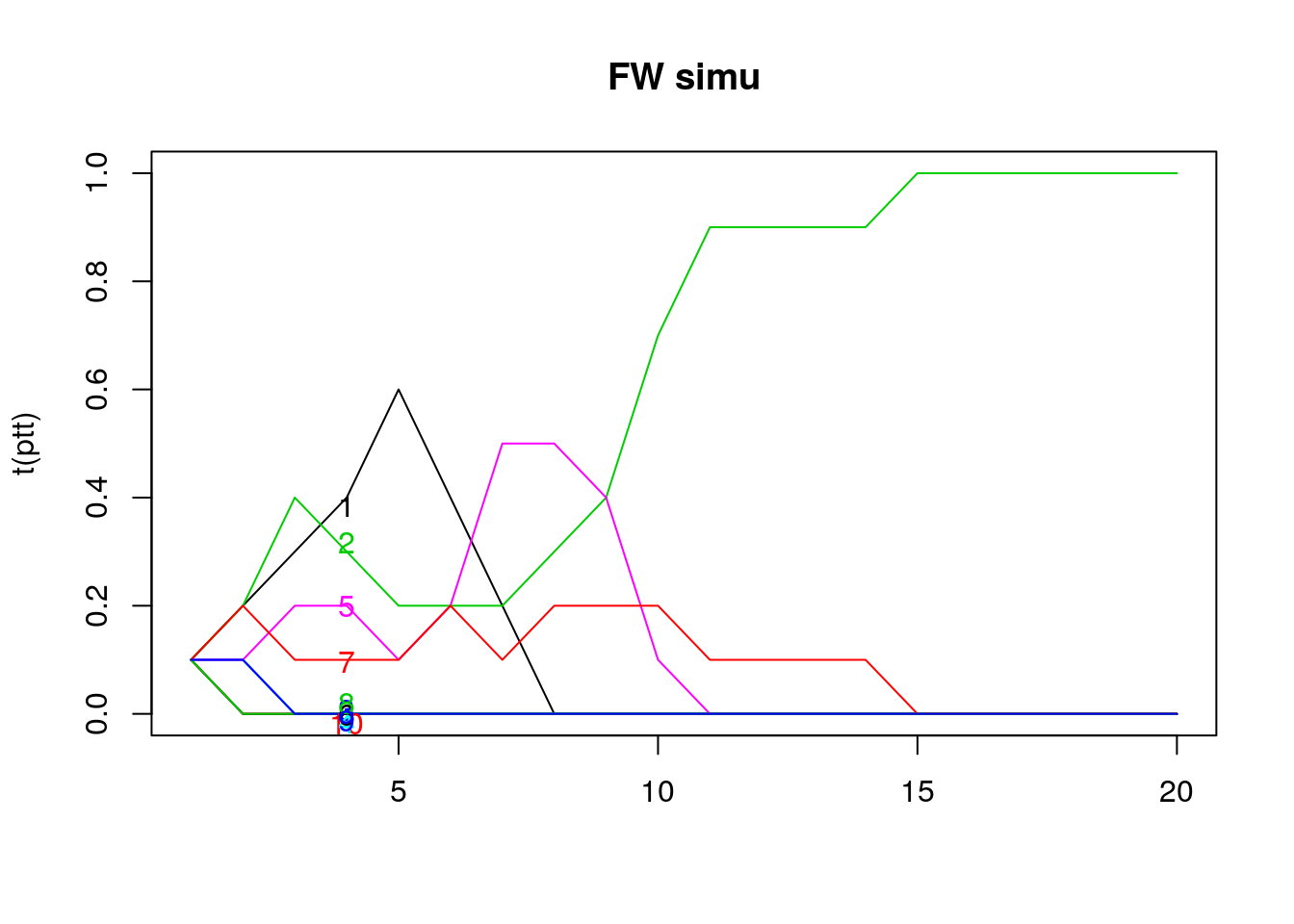
Figure 8.3: Time to fix
8.4.2 Expected time until fixation?
Answer for us is \[ \bar{T}_{fixed} = 2 \cdot N \]
Note: Biologists say \(4 N_e\). See Wikipedia “Genetic drift”
Now we carry out simulations of complete processes. In total, we draw 100 times each generation in order to get the time to fixation. For this example, the mean number of generations taken to get only one remaining line is 202 generations \(\approx 2 \times\) the starting generation size.
  T.vec <- NULL
  all.the.same <- function(x){length(unique(x)) == 1}
  set.seed(10)
  for (i in 1:100)  # 100 simulations
  {
      A <- fwm(N = 100, n_gen = 1000,mu = 0)   # generation process: rows are generations and columns are types
      extinction_time = min(row(A)[apply(A, 1, all.the.same)])  # obtain the first generation when all but one line went extinct
      T.vec[i] <- extinction_time
  }
  mean(T.vec)
## [1] 202.898.4.3 Path to fixation: a measure of homogeneity/heterogeneity
- How does the type change over time?
- We would like a measure of equality of the types of populations. A low measure would mean that the population is homogeneous while a high measure implies population heterogeneity.
- Let the chance that two randomly drawn individuals are of same type be: \[ G = \sum_i p_i^2 \]
- If we have two types, \(p_1 = \pi\) , \(p_2 = 1-\pi\). What is G if \(\pi = 0, .5, 1\)?
type_fun  <- function(pi_vector){
  oneminus_pi <- 1-pi_vector
  G <- pi_vector^2 + oneminus_pi^2

  return(plot(pi_vector, G, type="l", xlab = "Probability type", col="red"))
}

pi_vector <- seq(0,1,0.1)
type_fun(pi_vector)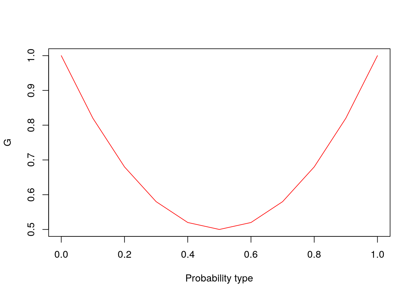
Figure 8.4: Probability of being the same type
- Let’s derive time path of G.
- Assume just two types, \(\pi(t)\)
The chance that two individuals are of same type \[G_{t+1} = P(\mbox{same parent})\cdot 1 + P(\mbox{different parent})\cdot G_{t}\]
- Notation: I’m going use K for pop size. Bio uses 2N.
The probability of having the same parent is \(P(\mbox{same parent}) = \frac{1}{K}\), where \(K\) is the population size. This also implies that anybody in the population can be a parent with equal probability.
Additionally, \(P(\mbox{different parent}) = 1- P(\mbox{same parent}) = 1- \frac{1}{K}\)
Then, \[G_{t+1} = \left(\frac{1}{K}\right) \cdot 1 + \left(1 - \frac{1}{K}\right) \cdot G_{t}\]
For simplicity, let \(H = 1 - G\):
\[ \begin{aligned} 1 - H_{t+1} & = {1 \over K} + \left(1 - {1 \over K} \right) \cdot (1-H_{t})\\ & = {1 \over K} + 1 - H_{t} - {1\over K}+ {1\over K} H_{t} \\ H_{t+1} & = H_{t} - {1\over K} H_{t} \\ H_{t+1} & = H_{t} (1 - 1/K) \end{aligned} \]
For many periods, we start at the initial probabilities.
\[ H_{t} = H_0 (1 - 1/K)^t \rightarrow H_0 e^{-t/K} \] So, H goes to 0 exponentially, just as G goes to 1.
8.5 Baby Names
For this section we will look at an application of changes in baby names from this paper:
“Drift as a mechanism for cultural change: an example from baby names” by Matthew W. Hahn and R. Alexander Bentley Proc. R. Soc. Lond. B 2003 270, S120-S123
8.5.1 Basic idea
- The process seems to be like Fisher-Wright because:
- people choose from existing set
- names are “neutral”
- draw proportionally
- Authors test to see if they can reject FW by comparin observed histograms to FW simulation
- They include mutation to get a stationary distribution. Note: failing to reject FW doesn’t mean it’s correct
 Source: Hahn and Bentley (2003)
8.5.2 Fisher-Wright simulation of Baby Names (Hahn and Bentley)
We download and prepare the data:
download.file(url= "https://www.ssa.gov/oact/babynames/names.zip",
              "./names.zip")
unzip("names.zip", exdir = "./names")

library(data.table)

filenames <- system("ls ./names/*.txt", intern = T)
mylist <- vector("list", length(filenames))
names(mylist) <- gsub(pattern = "[^0-9]", replace = "", filenames)
for (i in 1:length(filenames))
{
    myfile <- filenames[i]
    mylist[[i]] <- fread(myfile)
}

# Final dataframe
dt <- rbindlist(mylist, idcol = "year")
names(dt) <- c("year", "name", "sex", "N")

## Focus on male names from 1900-1909
my.dt <- dt[sex == "M" & year %in% 1900:1909]
foo <- my.dt[, .(N = sum(N)), by = name]
foo <- foo[order(N, decreasing = T)]
bar <- foo[1:1000,] ## 1000 top names

# Observed histogram of name occurence
my.breaks <- c(0, 2^(0:11)/10000)
bar[, p := round(prop.table(N),5)] # N column contains the share of times that a name is used
bar[, pcat := cut(p, breaks =  my.breaks, right = F, include.lowest = T)]

out <- unclass(prop.table(table(bar$pcat)))


my.x <- my.breaks[-length(my.breaks)] + diff(my.breaks)/2
Then we look at observed frequencies and they seem to behave as a power law (in log-log)
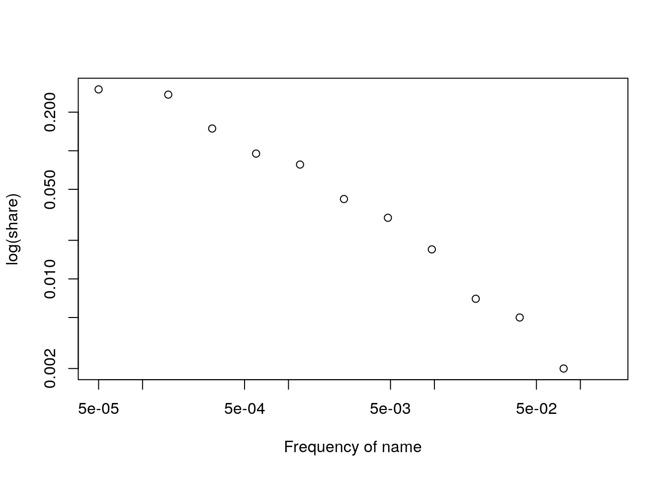
Figure 8.5: Power
8.5.3 Drawing their picture with simulation
Let’s look at evolution over time of G: chance that two individuals are of same type.
First we look at the case were there is no mutation
A <- fwm(1000, n_gen = 4000, mu = 0)
G.vec <- apply(A, 1, get.G)
plot(G.vec, ylab = "G", xlab= "# Generation", type ="l")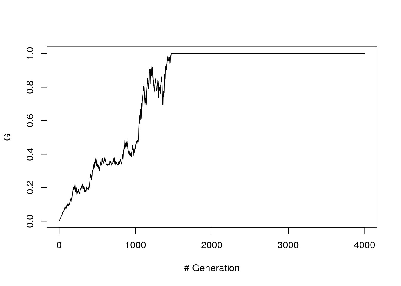
Figure 8.6: G path (without mutation)
With mutation a single trial shows that the G value oscillates a lot around 0.1.
N = 1000
A <- fwm(N, n_gen = 3000, mu = 4/N)
G.vec <- apply(A, 1, get.G)
plot(G.vec, ylab = "G", xlab= "# Generation", type ="l")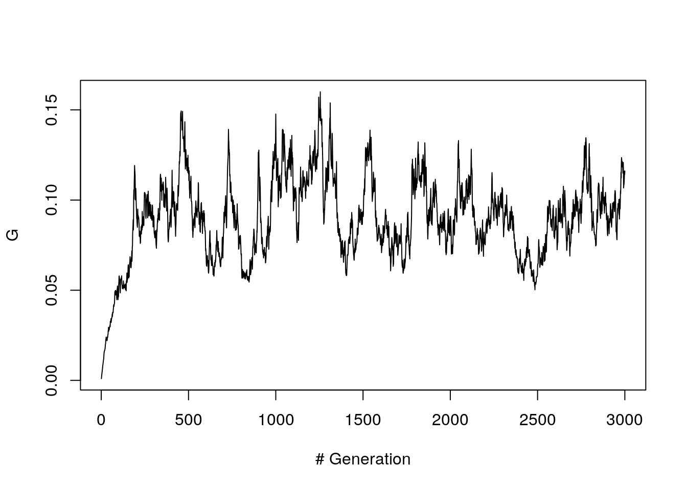
Figure 8.7: G path (with mutation, 1 trial)
We can increase the number of trials (up to 100 here) and look at the average (yellow horizontal line).
n_gen = 2000
n_trials = 100
G.mat <- matrix(NA,  n_trials, n_gen)
for (i in 1:n_trials)
    {
        N = 1000
        A <- fwm(N, n_gen, mu = 4/N)
        G.vec <- apply(A, 1, get.G)
        G.mat[i,] <- G.vec
        }
G.bar <- apply(G.mat, 2, mean)

matplot(t(G.mat), type = "l", ylab = "G", xlab= "# Generation")
lines(G.bar, lwd = 4)
abline(h = 1/9, lty = 3, col = "yellow", lwd = 5)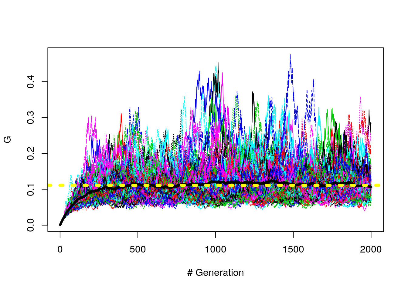
Figure 8.8: G path (with mutation, 100 trials)
Why is the mean about .11?
Gillespie tells us that \(\bar{G}\) is supposed to be \(\frac{1}{(1 + 4*Ne*\mu)}\)
How does \(4*Ne*\mu = 8\)?
Well, we have \(K*\mu = 4\) and since \(K = 2*Ne\), \(Ne = K/2\) (maybe)
8.6 Now we can simulate babynames
n_gen = 1001
N = 1000
## set.seed(1)
## A <- fwm2(N, n_gen, mu = 4/N)
#A <- fwm2(N, n_gen, mu = 8/N)
###############
#What about the fwm2 function?
#######################
A <- fwm(N, n_gen, mu = 8/N)
## ok, lets do power law plot of this
x <- A[1001,]
tt <- table(x)
ptt <- prop.table(tt)
my.breaks <- c(0, 2^(0:11)/10000)
p <- ptt
## bar[, p := round(prop.table(N),5)]
##bar[, pcat := cut(p, breaks =  my.breaks, right = F, include.lowest = T)]
pcat = cut(p, breaks =  my.breaks, right = F, include.lowest = T)
out <- unclass(prop.table(table(bar$pcat)))
out.hat <- unclass(prop.table(table(pcat)))
my.x <- my.breaks[-length(my.breaks)] + diff(my.breaks)/2
plot(my.x, out, log = "xy")
lines(my.x, out.hat)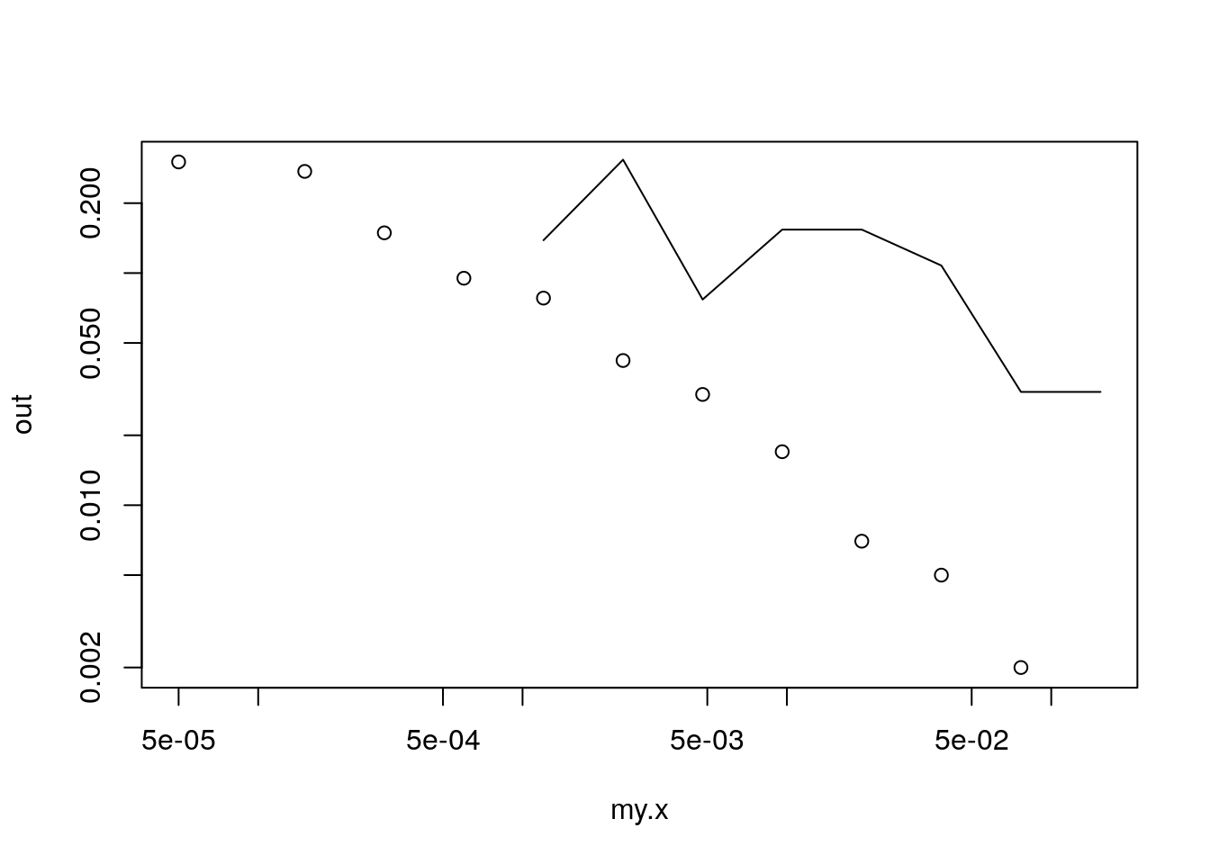
Figure 8.9: Baby Names Simulation
8.7 Conclusions
- Fisher-Wright an alternative to branching processes
- It reverses logic of reproduction, but gives similar quantitative and qualitative results
- A neutral model for other processes?
- Starting point for coalescent
8.7.1 Some potential criticism
- While we can’t reject that there’s some parameterization of FW that gives us similar disn, this doesn’t mean that we’ve found the right mechanism. (Just that we can’t reject it).
- What are some other tests of this mechanism?
- Markov assumption. We could see if each frequency really followed random walk.
- Perhaps we could see if variances were scaled to frequencies correctly.
References
Felsenstein, Joseph. 2005. “Theoretical Evolutionary Genetics Joseph Felsenstein.” University of Washington, Seattle. https://evolution.gs.washington.edu/gs562/2017/pgbook.pdf.
Hahn, Matthew W, and R Alexander Bentley. 2003. “Drift as a Mechanism for Cultural Change: An Example from Baby Names.” Proceedings of the Royal Society of London. Series B: Biological Sciences 270 (suppl_1): S120–S123.